


What’s easily viewable by everyone?
If you would like to put characters on pictures by PC, such as a postcard for example, I will give some hints on choosing the color for the characters and pictures.
At first, I want to talk about color hue. They are different for each person. Due to, sensitivity and the number of cones, everyone sees an image differently.
A lot of people suffer from color blindness. 5% of Japanese males and 0.2% of Japanese females suffer from color blindness.
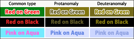
Look at the figures below. The figures show patterns of C type (People’s color vision at large), P type (red-color-blind), and D type (green-color-blind).
At first, I want to talk about color hue. They are different for each person. Due to, sensitivity and the number of cones, everyone sees an image differently.
A lot of people suffer from color blindness. 5% of Japanese males and 0.2% of Japanese females suffer from color blindness.
Look at the figures below. The figures show patterns of C type (People’s color vision at large), P type (red-color-blind), and D type (green-color-blind).
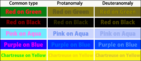
Typically, the combinations above are clearly bad for some people. When you must use the combination, the difference between Lightness of background and lightness of characters should increase. And, Making an outside line is also a good idea (see here).
(c) 2011 Yumie Mizuta, Mini tips note - Photoshop TIPS, All Rights Reserved.
Photoshop is a trademark of Adobe Systems Inc.